The Brutal Truth from my AI UX Consultant: Redesigning for Neurodiversity
When I first built the prototype for Ash, I built it with "Dad Logic." It was functional, robust, and looked suspiciously like a database. It made perfect sense to me. Ash, however, had a slightly different viewpoint!
The Problem with "Dad UI"
I realized that for a neurodivergent brain already swimming in overwhelm, my interface was just another source of anxiety. It was too much text, too many options, and zero dopamine.
I needed a fresh set of eyes. But instead of hiring expensive consultants, I turned to AI. I fed screenshots of the current system into a specialized AI model and asked it to critique the user experience (UX) from the perspective of a 12-year-old with executive dysfunction challenges.
The feedback was brutal, fast, and incredibly accurate.
The AI's Diagnosis
The AI consultant didn't hold back. It highlighted critical issues I hadn't even considered:
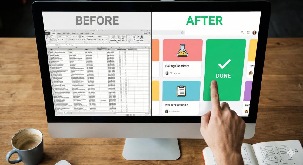
- Cognitive Overload: "Presenting a whole week of tasks at once is paralysing. She needs to see 'Now' and 'Next', not 'Thursday afternoon'."
- Lack of Reward: "Clicking a small grey checkbox is unsatisfying. The brain needs a visual reward for completing a task - a digital tic-tac."
- Text vs. Visuals: "Too much reliance on reading. Use consistent colour coding and icons to convey status instantly."
The Great Redesign
I spent the last two weeks tearing the student interface apart. The "Dad UI" is gone. The new interface is stripped back to the absolute basics.
Gone are the endless lists. Now, when Ash logs in, she sees one big button: "Up Next: Baking Cakes."
When she completes it, she gets a satisfying animation, a green smiley face, and the next task slides into view. It’s gamification, but for anxiety management.
The Verdict
Ash logged in yesterday after her last lesson and instead of a view of the next days lessons, saw the satisfying message she was done for the day and to go and relax. I heard the sigh of relief of a good days work!
Sometimes, the best design is barely any design at all.
Written by a Home Ed Family
Building Plan-Ed to help our daughter navigate her day. Join us to get early access to the tools we use.
Join the Waitlist